7 June 2015 | Articles, Articles 2015, Communications | By Christophe Lachnitt
Which Font Makes Your Message Look More Credible?
In 2012, American author and filmmaker Errol Morris conducted a non-scientific experiment on the New York Times website.
He asked the Times readers to take a quiz. The (hidden) objective was to gauge the participants’ responses to a passage presented in six different fonts: Baskerville, Georgia, Computer Modern, Helvetica, Comic Sans and Trebuchet – three serif, three sans-serif fonts.
As Morris recounted in his essay “Hear All Ye People; Harken, O Earth,” the conclusion of this experiment was very clear: “People are much more likely to believe something written in Baskerville than any of the other fonts.”
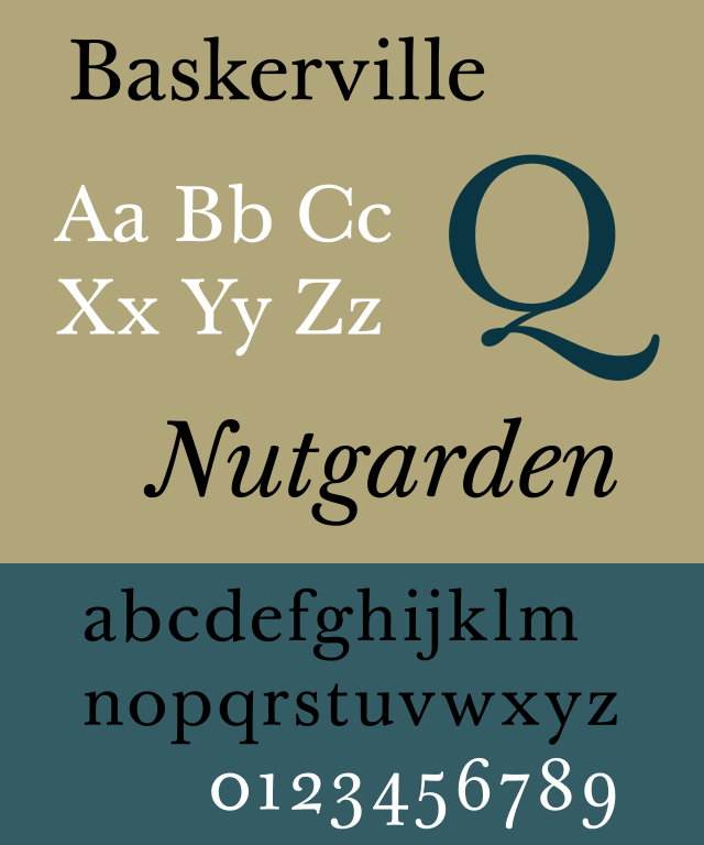
(CC) Paul Hunt
According to David Dunning, a professor at Cornell University, this font looks more credible because of its “sense of formality and gravitas.”
Some even compare the role played by fonts in written communications to that of voices in oral communications. Each voice’s timbre and each font’s graphic appearance generate a specific perception.
Superception is a media outlet focused on perception issues across communication, management, and marketing in the age of artificial intelligence. It features a blog, a newsletter, and a podcast. It was founded and is published by Christophe Lachnitt.