12 February 2023 | Articles, Articles 2023, Communications | By Christophe Lachnitt
Logo Or No-go
If you are having a hard time convincing your boss of the importance of a logo, show them these two examples.
They are related to two companies, one established, the other emerging, that have made incomprehensible choices regarding their logo. Indeed, the two logos of these highly visible brands have in common that they are largely illegible: Kia’s new logo reads more like “KN” and the logo of the On sports shoe brand is understood by many consumers to mean “QC.”

30,000 Americans search for the car brand “KN” on Google every month. So, every minute and a half, Kia makes it more difficult for a prospective American customer to make initial contact with them.
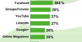
As for the interest in “QC” shoes, it remains strong despite On’s growing popularity due to its partnership with Roger Federer and its advanced technology:

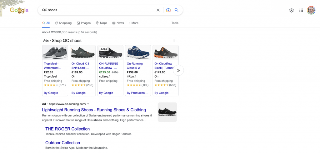
On’s executives are aware of the problem as evidenced by their advertising approach on Google:
The primary mission of a logo is to be easily recognizable in order to direct consumers towards the brand in question. This individualization certainly involves differentiation from the brand’s competitors, but it must first be based on an instant understanding of its identity.
If a logo, like those of Kia and On, does not fulfill this basic function, it does not accomplish its primary mission. In this case, Kia’s modernity and On’s humanity are not emphasized when their respective brand names are not intelligible.
Superception is a media outlet focused on perception issues across communication, management, and marketing in the age of artificial intelligence. It features a blog, a newsletter, and a podcast. It was founded and is published by Christophe Lachnitt.